
Ravilious’ ceramics for Wedgwood – not as well known, perhaps, as his fine and graphic art – have become a sort of holy grail for design collectors. They are applied design at its very best; quite rare and certainly rarefied.
Eric Ravilious (1903 – 1942) was both a fine artist and a commercial designer. The term ‘commercial designer’ was of his time, particularly the 1930s, when a few individuals were commissioned to design ‘commercial art’, everything from posters to pottery, paper to wallpaper, fabric to ephemeral furbelows. They often knew each other, this bunch. They worked for the same clients, sold their wares in the same shops. Some cohabitation and bedroom meanderings seem to have happened, too, but they lay (forgive the pun) outside the scope of this article. If Ravilious’ life was short (he was listed as missing in action (presumed dead) in Reykjavík, Iceland in 1942) his work was certainly sweet. Part of a group of artists and friends based in Essex, painting a soon to be lost England during the 1930s, his work (along with his friend Edward Bawden’s) has become collectable and much published. Ravilious’ ceramics for Wedgwood – not as well known, perhaps, as his fine and graphic art – have become a sort of holy grail for design collectors. They are applied design at its very best; quite rare and certainly rarefied.
When Ravilious began designing for Wedgwood in 1936 he was 33 years of age and already established as an artist and commercial designer. It is not clear exactly who introduced the artist to the pottery. In her book Eric Ravilious: Memoirs of an Artist, Helen Binyon (she was his lover; he was married to Tirzah Garwood), mentions that a first meeting with Josiah Wedgwood happened in 1935. And was followed by ceramic trials at the Wedgwood factory in Etruria, Stoke on Trent. Presaging this, Viktor Skellern, who worked at Wedgwood, had won a scholarship to study at the Royal College of Art in 1930, where he met Ravilious. Skellern returned to Wedgwood in 1935 to slip on the shoes of art director. By February 1936 Ravilious had his second solo exhibition at the Zwemmer Gallery on Litchfield Street, London – a sister space to Zwemmer’s art bookshop on Charing Cross Road. Ravilious was designing officially for Wedgwood by May that year. We can probably assume that coffee and gentlemanly discussions were continued between Messrs Skellern and Ravilious somewhere along Charing Cross Road around this time.
Ravilious’ first solid commission for Wedgwood was a Coronation mug for Edward VIII. It was never mass produced due to his abdication, but apparently Mrs Simpson managed to buy one. In one of his many letters (now handsomely published by the Fleece Press) Ravilious wrote to Binyon that Wedgwood paid him for six weeks ‘in the year’ of his time. He added that he had no idea of his fee but that he thought it likely to be ‘beautifully disproportionate to the time and effort.’ Ravilious was fully ensconced at Wedgwood by August 1936, and found himself coming up against the age-old argument of taste versus sales in their discussions. Of a visit to the factory that year, he wrote to Binyon: ‘You will be sorry that the [Wedgwood] family think my beautiful designs above the heads of their public and that to begin with, something should be done safer and more understandable.’ There follows a delightfully catty description of Laura Knight’s contemporaneous design for a commemorative mug, an ‘everything but the kitchen sink’ sort of design for Burleigh Ware. At the time, as Woolworths were to Harrods, so Burleigh Ware was to Wedgwood. The consensus was that although Knight’s design was bad (or ‘bloody’ as Ravilious described it) the sales would most probably be good. It seems the relationship between Ravilious and Wedgwood was never entirely smooth sailing and he executed many more designs than were ever issued.

Most of Ravilious’ Wedgwood designs played to his recurring artistic muses: bucolic and domestic scenes, gardening implements, ethnographic objects and bits and pieces from light industry. He seems to have re-used ideas, sketches and drawings from other projects in his work for Wedgwood. His first dinner set for them, Persephone, came out in 1936, originally named as Harvest Festival. It was re-named Persephone in 1938, but by 1953 the backs had Harvest Festival stamped on them again. This design was inspired by Ravilious’ drawing of 1936: Harvest Festival and Loaves, sketched at his local church in Castle Hedingham, Essex. He also produced devices for the Cornhill magazine that same year, several of which illustrate the fish, vegetables and horns of plenty that form the cornucopia on each piece of Persephone. The design also has a rolling firework-like patterned border, utilised in a variety of ways across the range. Persephone came in blue, green, pink and yellow colourways, along with a special Coronation Golden Persephone, issued in 1952 (though it should be said that Ravilious did not have the right of veto for colourways).
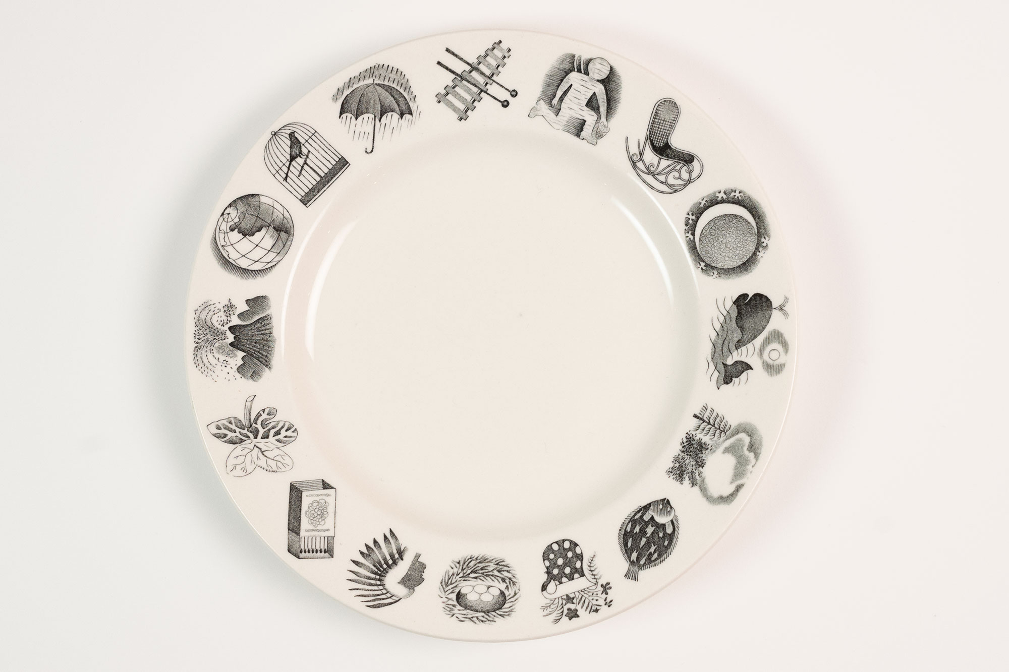
In 1937 Ravilious produced his Alphabet set for Wedgwood. The design was a delight; an alphabet as only Ravilious could imagine and illustrate it. And it was the only set Ravilious designed that was aimed at younger clientele but bought, of course, by the grown-ups. The set consisted of a large and small mug, a porringer, a plate, a double egg cup, a jug and lamp base – quite a lot for baby. The design for Alphabet is rather sophisticated for a children’s set. Among the subjects chosen to illustrate letters were a bentwood rocker, a bird’s nest, an Indian headdress and a box of matches; one might struggle to connect most of the illustrations to any children’s book of the time. Nevertheless, Ravilious’ Alphabet is not half as sentimental (not to say mawkish) as Mabel Lucie Atwell ceramic offerings designed for Shelly – an example, perhaps, of how far Wedgwood were willing to go to challenge the status quo.

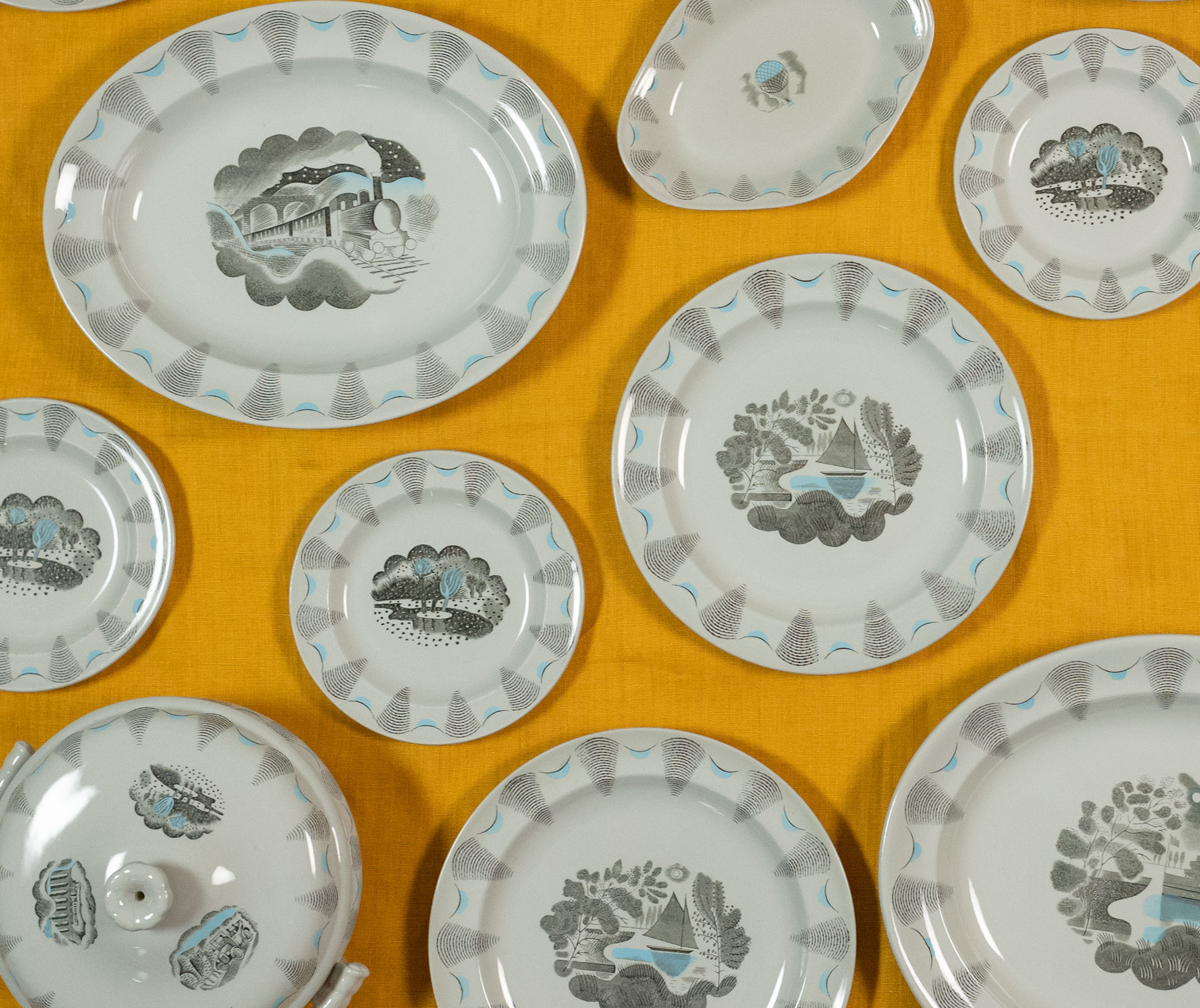
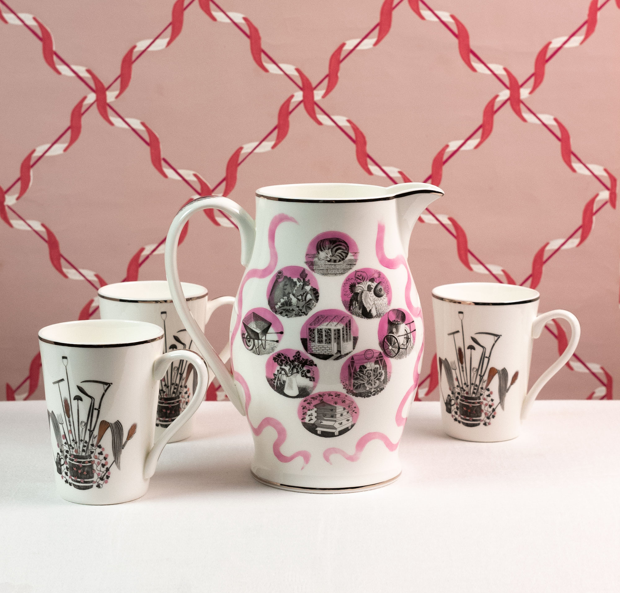
Today one of Ravilious’ most coveted ceramic designs is Garden from 1938. Decorated with exquisitely detailed vignettes of outdoor play, it is perhaps the most ‘Ravilious-y’ of all his Wedgwood designs. Swimming, reading in a stripy deckchair, and tree felling all feature. The accompanying Garden Implements lemonade set, issued a year later in 1939, showcased gardening tools – with a swish of a twig broom on the handle and an old oak barrel (that also appeared on one of the Garden plates) full of interesting paraphernalia on the side. Both Garden sets seem quite suited to imagined refreshments under the sun; drinking to a soundtrack of birds, squeaky crickets and croquet taps. Ravilious’ life-long love of gardening showed itself in his watercolours and in the Wedgwood set. Great Bardfield, where Ravilious lived, was (and is) a sleepy, beautiful moment in time. Rows of historic houses line the main street in a picture-perfect English village and living there must have provided Ravilious with a great deal of intimate inspirations. The same year Garden came out, Ravilious produced designs for his Travel set, a slightly more future-themed offering, though nothing incongruous as far as he was concerned, as he loved trains and vehicles. Travel was not put into production until 1952, when a darker colour palette of grey with blue transfers was chosen. Whether the delay was because of the war or because Wedgwood wasn’t ready for it, is unclear.
In terms of the shapes Ravilious was asked to design for, many were stock Wedgwood – rather old fashioned when compared to the triangles and angles of art deco style ceramics. The technique Wedgwood used to realise Ravilious’ designs was transfer printing, a technique popular since the mid-18th century. It was a skilled technique, and one Wedgwood engravers were very well placed to do. though at first Ravilious, worried about quality, had wanted only one man to work engraving his designs. Skellern set all his men working on them in secret, only revealing the fact to Ravilious after he’d seen the results. Ravilious remarked: ‘I will never argue about the Wedgwood engraving any more, these chaps are without doubt the finest engravers I have ever met.’ Wedgwood’s craftsmen were aided by the sheer sepcificity of Ravilious’ designs, many of which have survived and are reproduced in a Richard Dennis’ fascinating Ravilious and Wedgwood: The Complete Wedgwood Designs of Eric Ravilious.
Ravilious’ ceramics were really more about applied design than designed form, at a time when the term ‘applied design’ was still a profanity in some circles – including those Ravilious relied on for work. Magazines of the period, like Art and Industry, were filled with ‘he says, she says’ arguments on the question of taste in design. And for Ravilious there was a fine design line to be tiptoed between influential industry thinkers and clients who wanted sales at any cost. Ravilious’ letters show he was clever at being patient with clients, before having his rant when writing to friends, most of them understanding artists themselves. His letters also show he was living the typical (then and now) peripatetic life of a freelance commercial designer, skipping from pay check to pay check. In September 1938, as the country slumped deeper into political unrest, Wedgwood ‘let go’ of Ravilious’ services, after he’d offered to resign. With his final cheque came a reckoning showing that Persephone had been his best-selling design. His ceramics continued to be produced: in the postwar period some designs were re-issued posthumously, and some (like Travel) were issued for the first time.
Ravilious’ designs for Wedgwood never achieved huge sales. One presumes they were available in Wedgwood’s London showrooms and through their catalogues, and his friend Cecilia Dunbar Kilburn would surely have sold some of his ceramics in her London gallery: Dunbar Hay. But what to our eyes now look like perfectly poised and covetable pieces, may, at the time, have been a bit hard to place. They might have read as a little dull next to splashy Susie Cooper and Clarice Cliff ceramics. On the other hand, they would not have been quite as robustly minimalist enough for the European modernist groupies, who may rather have reached for Wedgwood’s plain, parsimonious (but pretty) Keith Murray range. Luckily for us, we are able, with the gift of hindsight and the emerging research available on Ravilious and Wedgwood, to celebrate his ceramic designs as quintessential examples of his sprightly line – and as fine objects we might still like to own, even today.
Jane Audas is a writer, craft & design curator and digital consultant in museums. She is a design historian by training and by inclination. Jane writes a blog about paper, craft, design and toy things – much of it from the inter-war years – that can be found on her website: www.janeaudas.com.